Accessibility people: “Consistency is of the utmost importance!”
Also, accessibility people: 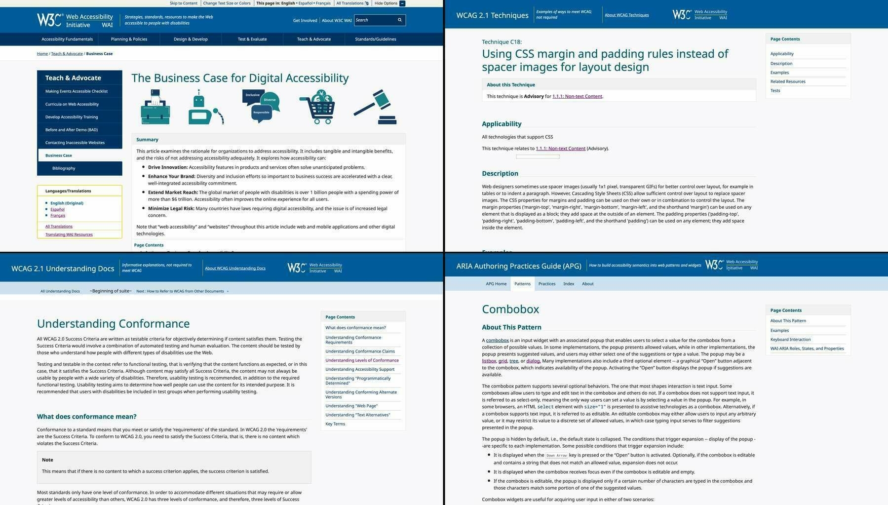
🤷♂️
(Note: I worked on the main WAI website redesign, so this is also self-critique.)
Accessibility people: “Consistency is of the utmost importance!”
Also, accessibility people:
🤷♂️
(Note: I worked on the main WAI website redesign, so this is also self-critique.)